

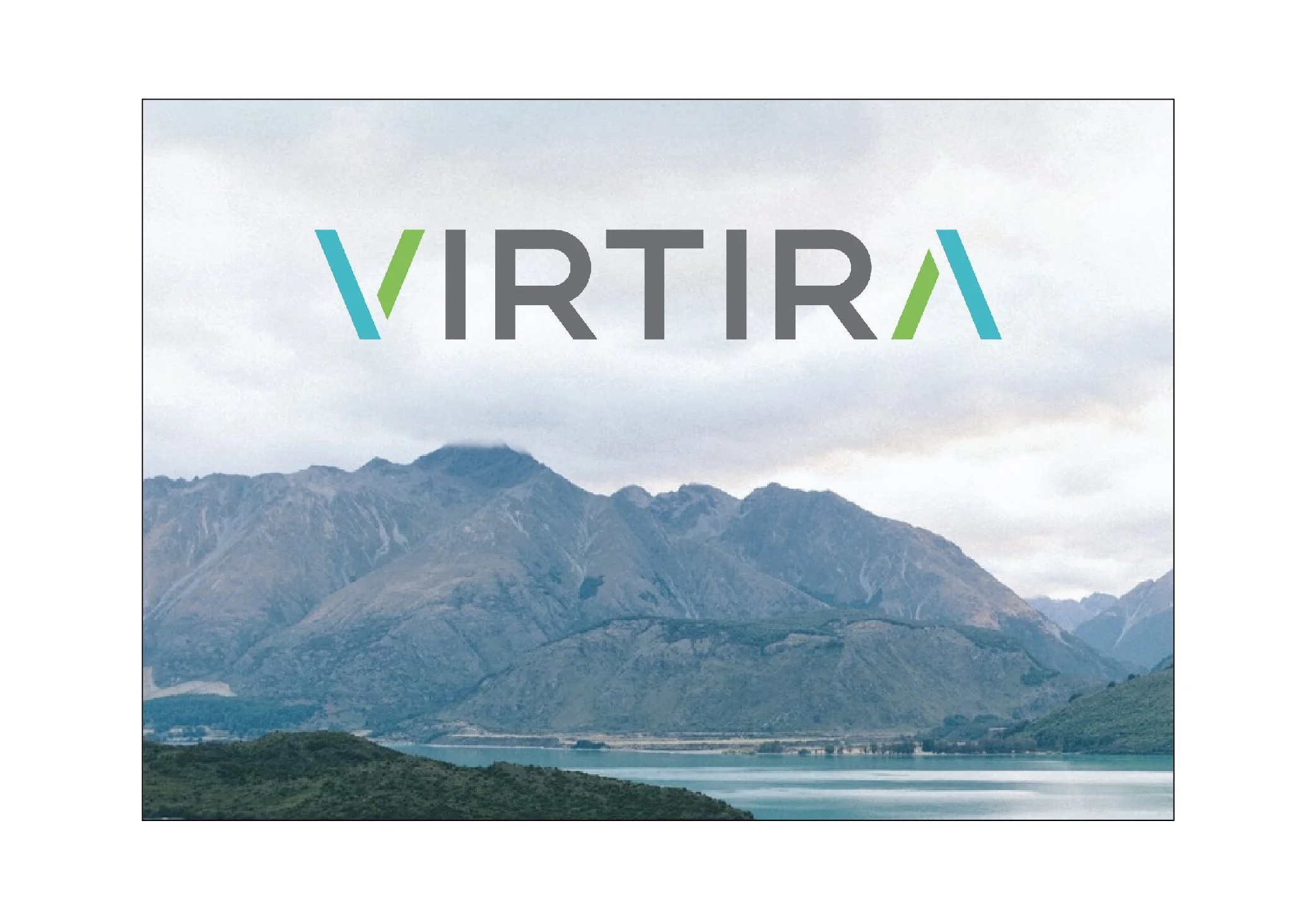
Virtira
Progress through Process.
Virtira, a mid-sized Canadian Tech Company, was undergoing a lot of growth in 2020 as the need for WFH efficiency became necessary – and fast. The organization believes their results don’t happen by chance but by expert level engagement with their clients. Looking inwards to create lasting, transformational results, outward.
This design captures the pillar of Virtiras strengths, productivity. The symbol, made up of six “V’s”, one of which, has its right end extended to also resemble a checkmark, showing progress and growth. The “V”s point inwards to demonstrate how Virtira looks inwards at organizations to work through issues and challenges. All of this, to create consistent, lasting results outward.
In addition, the “V”s form a wheel or a gear like shape, again showing movement and continual work being done. Each symbol is repeated coinciding with the consistent outcomes of their work.

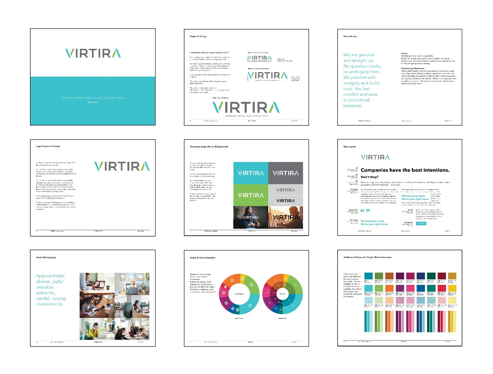
Brand Guideline
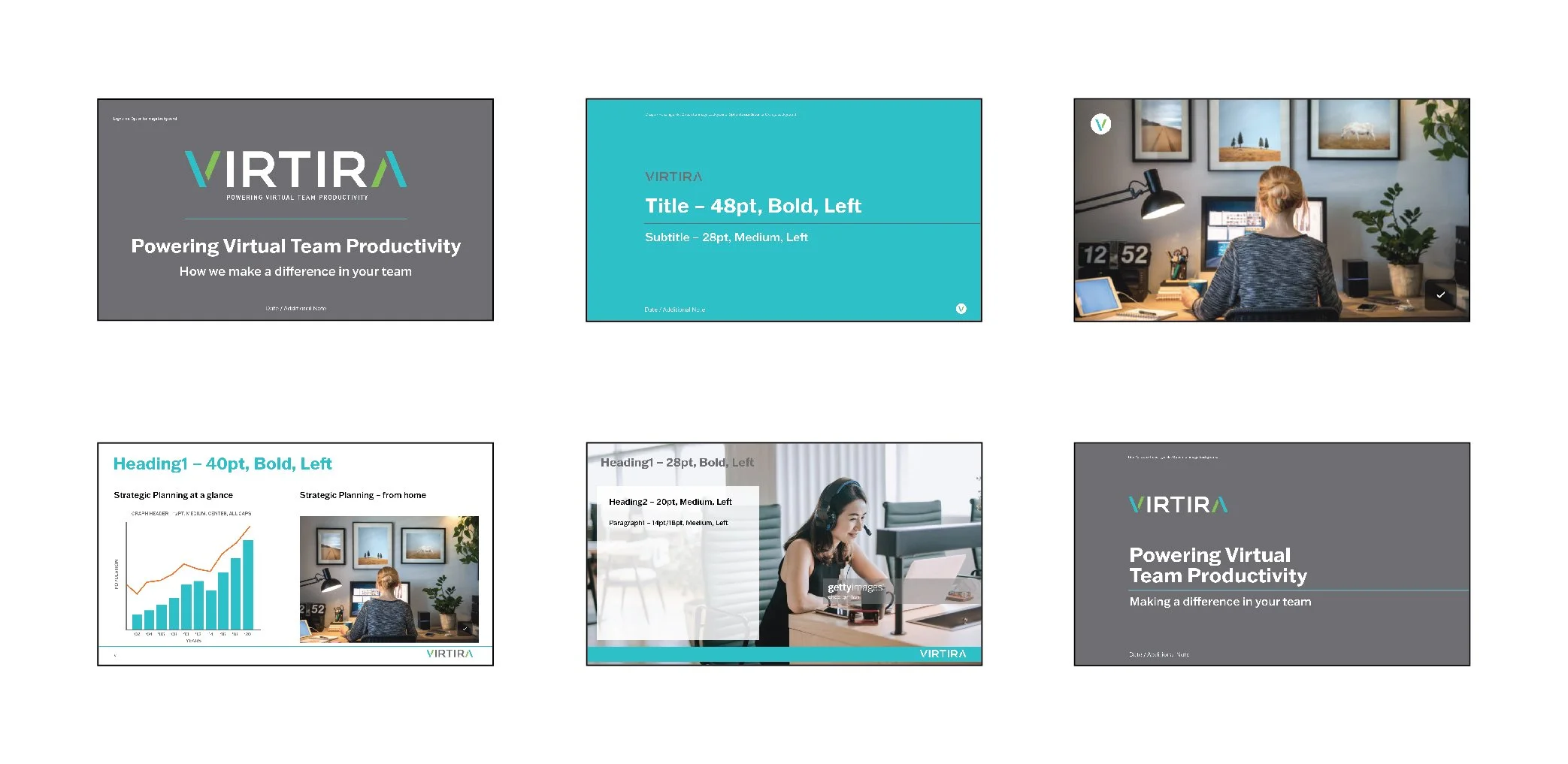
Powerpoint Template